For complex images, such as infographics, maps, or charts, there is typically too much information in the image to accurately describe it in the alt tag. In these cases, you will use what is called a "long description." Long descriptions are a concept, and not a specific implementation method. A long description, sometime called a text alternative, can be a combination of text and HTML and should be available to all users.
When creating a long description, you should ask yourself the following questions:
- Purpose: What parts need to be described in text?
- Hierarchy: How do you order text so that it follows a logical order?
- Meaningful images: Is there any context that is provided by visual cues?
- Location: Where is the text alternative going to live?
Where is my long description going to live?
While there is no "one size fits all" solution, the following are suitable implementations that you can use:
- On the element/image/graph: In the form of alternative text
- On the page: Explicitly state that it is a text alternative. You can use a skip link to jump to the alternative, place the alternative directly below the graph, or describe in the alt text where the alternative lives on the page
- On a separate page: Place a link below the complex image that brings you to another page where the alternative lives. Make it clear to the user that they will be opening a new window/tab or going to a new page
- In a document: As a last resort, but make sure the document is accessible
Example of a long description:
To create a long description, you should provide an overview, give the values, and describe the presentation. Since you can use HTML for long descriptions, consider putting your values in a table.
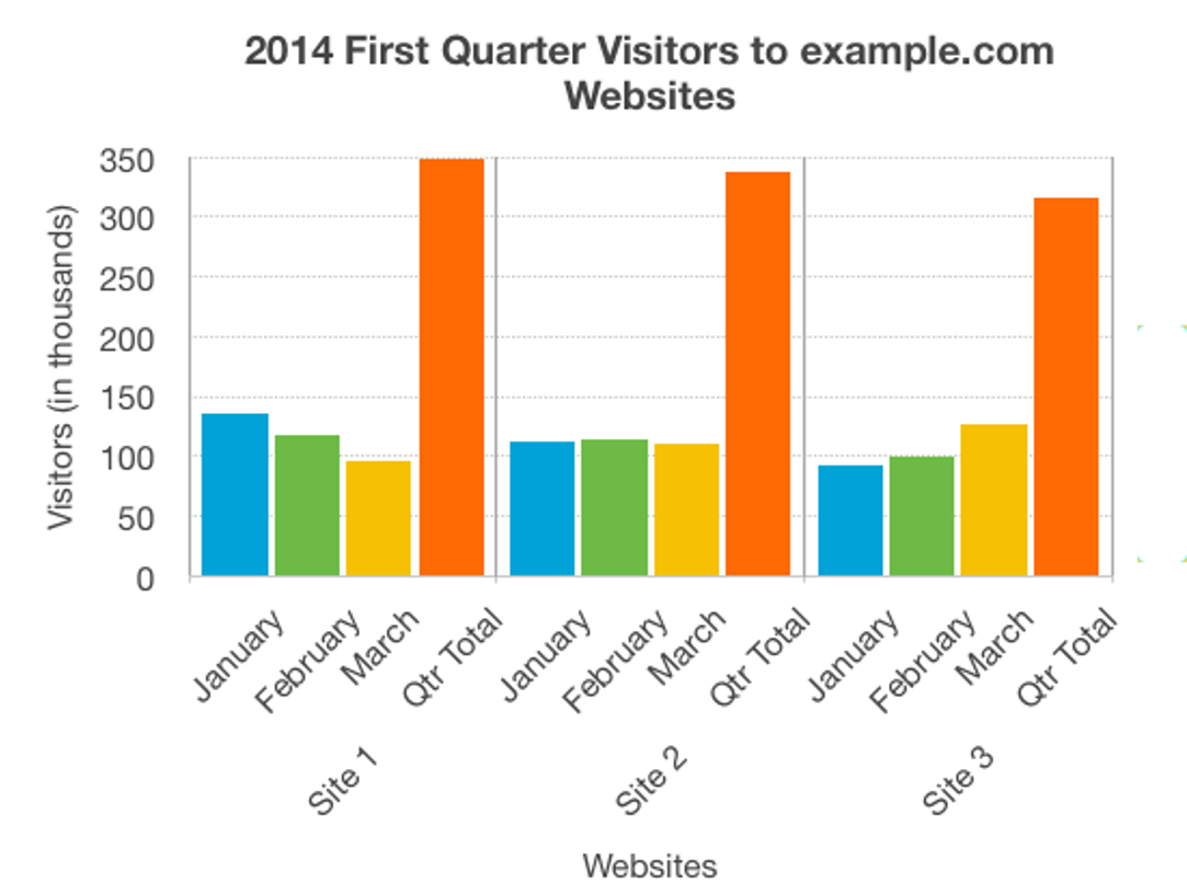
Overview:
The chart shows the website hits for the first quarter of 2014. It shows that Site 1 has more visitors than either of the other sites, but the number of visitors is decreasing. Site 2 has a fairly constant number of visitors, while for Site 3 page hits are increasing month on month.
Values:
Numerical values presented on the image: 2014 First Quarter visitors per site (in thousands)
| Period | Site 1 | Site 2 | Site 3 |
|---|---|---|---|
| Jan | 135 | 112 | 92 |
| Feb | 117 | 114 | 99 |
| March | 96 | 111 | 126 |
| Quarter Total | 348 | 337 | 308 |
Presentation:
The bar chart represents both the number of visitors per month for each website, and the total number of visitors per website for the entire quarter. Website visitors for each month are represented using columns lined up horizontally, with heights indicating the number of visitors. A fourth column is provided for each website with the accumulated site visitors for the quarter.